Introduction.
Elements of design are the most basic visual components of any composition. Understanding the elements of design, how they affect and complement each other, and what messages they convey is the way to step up with your photographic images and create stunning work that reaches out to people's hearts and souls.
hese are the building blocks for creating your own work of art. Putting these elements together, and knowing how/when to use them will make your photos far more effective and purposeful. These elements are all around us, we just need to train our eyes to see and capture them, and our minds and souls to translate them into conveying our own emotions and ideas. Then, and only then, will our work become eye-catching and dramatic.
hese are the building blocks for creating your own work of art. Putting these elements together, and knowing how/when to use them will make your photos far more effective and purposeful. These elements are all around us, we just need to train our eyes to see and capture them, and our minds and souls to translate them into conveying our own emotions and ideas. Then, and only then, will our work become eye-catching and dramatic.
Vivian Maier
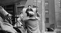
In the image that i chose of Vivian Maier she has made show that the image has lots of geometric shapes and diagonal lines. I also like how the photo gives an illusion that she is on the roof top of that building but actually isn't. The use of light is also very effective in this image as she has mange to make her self standout form all thats going on in the picture. I find her work to be very interesting because of how effortless it looks but still vey dramatic. The fact that she almost looks blurred out in this image but everything else is in full focus given an idea of isolation being that she was a maid. The different tones of the image further break it into three. There are a lot of harsh shadows on the left side of the image, compared, to the soft lighting on the right side. The source of light is natural and is mostly streamed onto the man and woman. The image has a lot of grey tones, which can also appear quite sepia to the right side of the image. The photo used the rule of thirds and is cluttered, displaying details of her surroundings in each corner.
Francesca Woodman
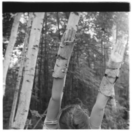
Francesca Woodman was an American photographer best known for her black and white pictures featuring herself and female models. Many of her photography show young women who are blurred due to the movement and long exposure, merging with their surrounding or whose faces are obscured. In the picture above, I like how she has used her hands to create the illusion that they are trees which also create diagonal lines. Just as in her other photos, I have noticed that she mimics the lines or shape that are created by nature by creating the exact same shape or line. Her work mostly has very strong use of like because it’s mostly natural and directional. However in the hope above the light isn't as strong due to the smaller trees shading the light coming from behind. The trees in this image are the main source of texture as you can tell from the cracks on the trees and also on from the leaves on them. Looking at the image, I had noticed the cracks in on the trees and emditly knew that the was texture in the image. The focus of this image is very interesting because she has made show that the front of the image is in sharp focus and the trees in the back are all blurred out. By doing this she has made those little circles of light reflect through the trees. Francesca took the image from a bird's eye's view because the picture is above eye level and it creates an illusion that the image is taking at an eye level. she made sure that the models face wasn't in the frame to make us pay attention to the models hand. she ask made sure that the hands of the model is in a particular position so it blends in with the


After looking at Francesca work, i had to take a series of 8 pictures inspired by her work. When taking my pictures, i had to think about the the tone, contrast and texture. I chose this elements because i was really fascinated by how Francesca uses them in her own images. taking this photos i learned how to make smaller frames in to really interesting images. i really like the idea of using light in a very delicate way, which sometimes gives the image a sense of movement. when taking my pictures i also had to think about the amount of light i capture in the image because too much light can sometimes make the image too bight and not enough light can make the image dark.
Harry Callahan
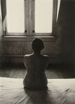
Harry Morey Callahan was an influential twentieth century American photographer. His pictures are mostly in black and white and always are about his wife Eleanor Chicago, daughter Barbara, nature and light studies. The photo that I have chosen of harry is one of her famous works called Eleanor Chicago. The photo has very strong contrast as it makes the object in the photo almost faded but visible. it also shows the use of light as the main source of is natural light coming through the window. I also like how visible the window is because it makes the image look very calm, being that there is a nude woman in the image. The fact that he has taking the picture facing straight ahead makes the woman in the picture the main forces. The light coming through the window creates triangular shapes and because the light is so strong, you can't really see what's outside the window. The focus of this image is very strong as he has kept just certain parts of of the room in focus and rest are almost blurred out with the bark shadow coming from the conner of the room. by doing this he has create a very depressed mood and its almost as if its a prison cell.
Margaret Bourke-White
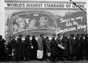
Margaret Bourke-White was an American photographer and documentary photographer. She is best known as the first foreign photographer permitted to take pictures of Soviet industry. Her work was well known for the story that it told an how she manipulates the natural light in most of her photos. The use of light in this photo is very effective because of how she has managed to make the poster stand out from these amount of people of people in-front of it. Its almost as if the poster was the main forces in this image which is and irony because the poster has a bunch of white Americans doing an advert for the american way and in the image that Margaret took u can see that the blacks aren't really happy. The angel in which she took this image is also very important because she could have easily cut off the poster from the shoot and made sure that just the black Americans were in the frame but she didn't so it makes the image even more interesting. the accessories in this image show texture because of the different materials that they made out of for example the lady with the basket.
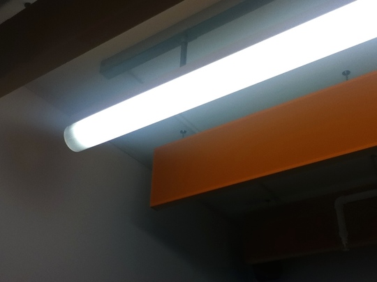
Taking an image without a camera
In this image the source of light is artificial as its coming from a lamp in the room. The light is coming from the centre of the image as i took it straight on, and also made sure the objects at the side are all blurred out. The light in this image is very strong as the image is mainly about it light and i have also manage to create lines with the light in this image. This image has no texture as the main object is very smooth and almost not visible because of the amour of light. there isn't really anything in sharp focus because the main object in this image is light and so it other objects really back and almost as if they don't exist. Because the camera is pointing directly at the light, it makes the photo feel very isolated. I took this image standing on a chair, and looking at the image straight on. By doing this it has made the image look as if its on eye level when it actually above eye level
Classmates responds
|
After describing my image that i took without, i then pared with one of my classmates to do a response to each others work. so this was her response to my writing analyse. i don't really think she capture what i was talking about in this image because there are another objects being shown in the image. I made is clear in my description that the image was taking straight and the object even though the object is above eye level, but in this image the object is above eye level meanwhile its meant to be on eye level. i have also noticed that the light isn't the mine focus in this picture. however i really like how the image is frame because you can see how the light effects the other objects.
|


These are my images that i took, looking at how to frame an image correctly also how to capture the right amount of light and line without getting random things in the frame. in this images i have made sure that i captured a variety of thing that are all very different. some of the images weren't as successful as the others because of how i took the but i have edited them to add more light and tone to them. In this images, the main source of light is day light because i took the pictures outside. Most of the light is coming from the side of the images because of the way my camera is positioned. The light in most of the images is very strong because of how harsh the shadows are reflecting on the objects. however some of the other images have very soft reflection of light due to the different angles the they were taking from. When taking this images i was very conscious with the type of objects that i included in the image because i want to capture just line and light in my photo. however i did manage to take one image that show texture which is the 15 image in the set of pictures above. when looking at the image i immediately notice how graphic it looks, and its almost like i can feel the texture just by looking at it. because there isn't a lot going on in my images, when taking them i decided to blur some parts out and kept some in sharp focus, by doing this i have manage to capture the light and line in the images. I think the focus in this images create a very soft and relax atmosphere which makes the images very elegant. I am really proud of this images because its the first time that i have actually focused on the framing of an image.
own images


After studing how to take pictures in a very ogarnised way and also how to frame your image, we them were meant to go home and take a serise of 4/6 photos and are mine focus was line and light. I had t consider several things when taking this image like how much light i was letting in the image and how geomeric and stuctured they look. The mine source of light in my images is daylight because i really enjoy tking pictures outside. In most of these images, the light is sort of everywhere however i have mange to edit them into black and white hich allowd me to show more contrast between the light to the dark areas. most of my images i think have very strong shadows whch make the objects in the photo very vibrant and visible in a prvocating way. when taking this images i have made sure that the objest in the photo all have very presized position, because it make pohot very elegarnt and ogarnised.
